|
|
Post by Gestapo on Apr 11, 2005 20:51:34 GMT -5
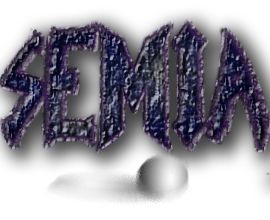
designer.... then you fucking make one....
and again
SPELL MY DANM NAME RIGHT!
|
|
|
|
Post by Father_Livonia on Apr 11, 2005 20:59:46 GMT -5
i say if we make a patch use todds.. if we just want like a website display use gestapo's or someone elses thats sophisticated and "isnt printable" or whatever the hell you 2 are arguing about
|
|
|
|
Post by ahhhhh on Apr 11, 2005 20:59:51 GMT -5
The promblem here is you guys LOVE FILTERS..... stop with the damn filters. If you are going to do your logo in paint or ps humor me please and STOP with the filters. Its not professional and looks very amatuer. Also stop stretching text unless you are going to readjust the kerning and tracking after doing so. Cause this also is cheap and amatuer. Furthermore, gastapo colors are meant to portray a mood. We are not SLAYERS..... i for one do not want to be depicted as a slayer or vampire. That SEMIA is all about just hiting its target. You need to use colors which convey a sense of meaning beyond........ kil, kill, kill and death. The colors just arn't working in coherhence what semia is about. - WE ARE NOT VAMPIRES, SLAYERS or jUST about killing. This is all i am getting out of you logo. Since, it contains gothic attributes more so then all else. Quote on Quote: from my friend (senior graphic design) "what the hell is that looks like a poster and the other one looks like ......lol"- me "why the hell do they do that" friend: "cause they obviously don't know what they are doing" but please...... get ride of the filter and use a type and leave it alone. Perhaps modifying it with some integrity.  |
|
|
|
Post by D. on Apr 11, 2005 21:06:35 GMT -5
I'm not going out of my way to type in special characters, We speak English on these forums, We aren't expecting anyone to go beyond that.  My 10 minutes of work, and at least mine doesn't hurt people's eyes  |
|
|
|
Post by Gestapo on Apr 11, 2005 21:06:56 GMT -5
MY NAME IS GESTAPO DANMIT!!!! GESTAPO!! G E S T A P O!!!!!!!!!!!!!!!!!!!!!!!!!!!!!!!!!!!!!!!!!!!! I didn't stretch the text...... if we all suck at it so much, and your so great, YOU MAKE ONE  there ya go! happy...... no more of your "WERE ALL SLAYERS" crap.... Its blue... color of water... cool and calm... |
|
|
|
Post by illustrator on Apr 11, 2005 21:12:00 GMT -5
.!..
Yes..... damo gets the idea. However, you don't want to have 4 different type faces. Two at the most.
Logo:
-clear and decisive. In the prusuit of "art" do not forgget the goal. To convey the message..... OUR NAME. Which i can barly see "G" STOP ;D.
|
|
|
|
Post by D. on Apr 11, 2005 21:12:37 GMT -5
here's another one more remeneese of a "delta" type feel or something more serious.   i was thinking about perhaps using this one for semiauto or something instead. I like how it has a more "serious" soildier type mood to it. |
|
|
|
Post by El Phantasamo on Apr 11, 2005 21:27:37 GMT -5
MY NAME IS GESTAPO DANMIT!!!! GESTAPO!! G E S T A P O!!!!!!!!!!!!!!!!!!!!!!!!!!!!!!!!!!!!!!!!!!!! I didn't stretch the text...... if we all suck at it so much, and your so great, YOU MAKE ONE  there ya go! happy...... no more of your "WERE ALL SLAYERS" crap.... Its blue... color of water... cool and calm... I still like this. Add a red border around the text (not drippy), and i think we got some really cool T-shirts. |
|
|
|
Post by cant log in on Apr 11, 2005 21:28:59 GMT -5
G-Stop Wrote: no more of your "WERE ALL SLAYERS" crap.... Its blue... color of water... cool and calm... - this is were you are wrong. The temperature needs to be warmer to convey the type of feeling we need. You still have to very COOL colors working in correspondance with one another. You can not think of color as hues when used..... color needs to have reasoning. Color is not just "i throw that on because it looks good". Color is used to further emphasis a mood. This is done via varying, the temperature, value, intensity, and hue. You need to use all in coherence with one another. For you can have a cool hue and make it warm and vise versa. temperature is really the main concern when the logo comes down to "looks"... then the hue is used in correspondance with the temperture to further emphasiz meaning. - DAMO why did you quote my post? - there is ONE typeface there.  |
|
|
|
Post by inFamous1 on Apr 11, 2005 22:20:02 GMT -5
allrighty here we go... www.graphicdesignforum.com/desktopdefault.aspx?f=36&m=20303&tabid=137www.graphicdesignforum.com/desktopdefault.aspx?f=36&m=15452&tabid=137This is basically what i want to say but, better written. I might try my hand at one more i have a kick ass idea. I will need about a week cause its going to be a bit more complex but, still appear simple. Anyway here is a example of MY identity/logo i did for school on a business card.  A logo appears simple, easily reconicable, decise and clear. Remenesse of its intended mood and one which it conveys. As you can see it is not allways a reconizable "object". Some of the best logo's are "abstract" in a sense. However, all abstract art starts out as something.  If you want a proffessional appeal create yours in relationship to above criteria. Ultimatly you will have a more successfull logo.  |
|
|
|
Post by inFamous1 on Apr 12, 2005 0:26:17 GMT -5
This is someting in development  I figure define the star through the wings of the bird and add a the slight definition of a open claw on the lower right. Its in development stages and should be complete within a few days depending on how much sh*t for school i need to get done.  The ultimate goal is to convey a sense of a bird in the act of swooping down swiftly and grasping its prey. However, instead of the conveying the act of killing through rampuctuous colors and design my goal is to do so via a "prestine" and "honorable" approach. More so then just slaying m"other F**kers for the hell of it without honorable reasoning. OK after going back to my origional bezei drawing i decided to re develop it to me more detailed then the above. This is generally what we would be looking at in regards to design. However, i have not yet added the birds eye or the claw.... which is more then likly going to quite large. Like the bird is coming at you.  |
|
|
|
Post by inFamous1 on Apr 12, 2005 3:45:56 GMT -5
 Allready this is the "final". I personally like this one more then all the rest i created. 7 hrs ago it was just an idea because g-stp kinda p'ed me off. Now in living color a LOGO. I decided to have the text interact with the logo design. Using the bird as a sort of frame for everything to rest and at the same time be the logo. However, the star is more our logo then anything else. The bird is more there to create interest in the design. clear, decisive and to point- there ya go.  If anyone is wondering the feathers were left out because i didn't want them to interupt the text. Since, it is the most important part of the design. Folling around i actually came up with this for the actual "simple" logo.  |
|
|
|
Post by D. on Apr 12, 2005 6:11:39 GMT -5
Is that Bird upside down?
|
|
|
|
Post by Knief on Apr 12, 2005 8:43:19 GMT -5
I don't know about anybody else, but I see a penguin when I look at that bird. The shape of the head and the tips on the wing are too round. Also, SEMIA isn't a team, so the text should read "Southeastern Michigan Airsoft."
|
|
|
|
Post by inFamous1 on Apr 12, 2005 10:50:35 GMT -5
what can i do to make it look less "penguinish"?
Since your going to critique be helpfull.
- use straight lines on the beak?
- use straightlines alltogether?
- change the colors?
- what?
|
|