Mitch1313 at school
Guest
|
Post by Mitch1313 at school on Apr 12, 2005 11:36:29 GMT -5
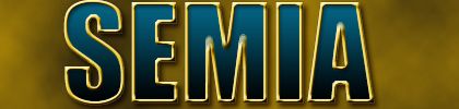
I love Todd's logos wit the birds, but its still neccessary for you to take off the word "team" becasue we aren't a team. We are just South East Michigan Airsoft. You could even write somethign cheesy like "We are Airsoft" at the bottom. But don't, jsut take off team.
Todd write Gestapo's name right so he stops bitching, and nobody else get an attitude on here, becasue it ruins the soothing environment that proboards usually manages to present to me.
|
|
|
|
Post by Father_Livonia on Apr 12, 2005 13:52:14 GMT -5
i like the one todd did of just the wing and the star... it looks really clean, the reason i posted mine of my rifle is simply because i think it looks cool, now i have that off my chest.... thanks for the free lessons tood ;D
im taking a 3 hour graphics design class next year so hopefully i will be pretty good at PS and the graphics community.
|
|
|
|
Post by El Phantasamo on Apr 12, 2005 14:31:41 GMT -5
I do like this one for an official logo/insignia  But to honest, I still like Gestapo's piece for a T-shirt.  I was not kidding about the warm fuzzy "Slayer" ablum cover feel. |
|
|
|
Post by Gestapo on Apr 12, 2005 14:41:55 GMT -5
mine isn't in vector so printing would not look good.
|
|
FireFox
Full Member
 YARRRRRRR
Posts: 493
|
Post by FireFox on Apr 12, 2005 15:21:32 GMT -5
what can i do to make it look less "penguinish"? Since your going to critique be helpfull. - use straight lines on the beak? - use straightlines alltogether? - change the colors? - what? i think in order to make it look less "penguinish" you could make the wing tips more pointy and instend of a blue black blind you could try a brown dark brown blind but its up to you |
|
|
|
Post by Knief on Apr 12, 2005 15:34:55 GMT -5
Sorry I couldn't elaborate more, I was alrady late to class. Birds of prey, hawks, eagles, falcons, whatever, usually don't have a straight line going from the tip of their beak around their heads and to their backs. There is an elevation where there eyes are because their eyes on on the front of their heads in typical predator fashon. Animals (birds included) who are more typically prey, have eyes on the sides of their head to facilitate a wide range a vision to watch its ass. To do it, they sacrifice depth perception. Animals that are typically predators (once again, birds included), have eyes on the front of their heads to they can have better depth perception to focus on their prey. To facilitate ths set up, they need to have a brow so the eyes can face forward. Check out this eagle for reference: www.northislandwildliferecoverycenter.org/Eagle%20Head%20Shot.JPGAlso, like firefox said, make the tips of the feathers on the wing more pointy, and dark brown might be a better color. A different curve underneath the eye might help too. Perhaps something more joined with the beak. |
|
|
|
Post by Gestapo on Apr 12, 2005 15:44:30 GMT -5
 i think people will think of SOCOM when they think of this, and when they think of SOCOM.... they think of stealth and amaizing weapons skills and a really cool video game  |
|
|
|
Post by infamous at class on Apr 12, 2005 16:53:23 GMT -5
^ exactly why i used the socom cover as a general guide to the color. I had to cool down the feeling of the logo. I figured the best way would be to add some cool color which reflects the above attributes.
Allready- i'll modify the bird a bit and see what comes out of it.
|
|
|
|
Post by El Phantasamo on Apr 12, 2005 18:05:08 GMT -5
^ exactly why i used the socom cover as a general guide to the color. I had to cool down the feeling of the logo. I figured the best way would be to add some cool color which reflects the above attributes. Allready- i'll modify the bird a bit and see what comes out of it. Can we merge TZ's bird With Gestapo's latest piece? |
|
|
|
Post by Mitch1313 on Apr 12, 2005 18:28:04 GMT -5
 Mitch, Paint Pro Extraordinaire |
|
|
|
Post by El Phantasamo on Apr 12, 2005 18:34:50 GMT -5
[/img] Mitch, Paint Pro Extraordinaire[/quote] No, no no no noooo Dont make me bust a hi-cap in yo ass  Now  |
|
|
|
Post by Gestapo on Apr 12, 2005 18:45:36 GMT -5
i actually think this looks really nice 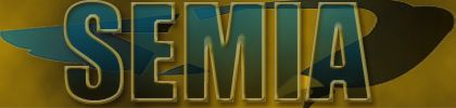 |
|
|
|
Post by inFamous1 on Apr 12, 2005 19:14:21 GMT -5
another rule of thunmb- don't use transparencies.
I know they look cool and all but, when printed- its not a pretty sight at time s belive me i know. Furthermore, i got hammered for using them in one of my designs. Even though it looks good.... don't do it.
The logo needs to be as visable as possible.
Gestapo what type face did you use for yours? or.. did you just copy cut paste a socom 2 logo from the net and to some editing? If that is so i wil trace the letters and we will have our very own CUSTOM typography,lol. ;D
- personaly i like gunplay more.... thats actually the name of the type i used in my design.
ahh........... and don't basterdize my wing. If your going to make a logo please use your own graphics. ;D
The promblem with ptting that wing behind there though is now its not visable. We need the identity to stand out just like the text. We are not trying to confuss our viewer but convey information clearly.
|
|
|
|
Post by Gestapo on Apr 12, 2005 19:16:16 GMT -5
this logo is just for the site and stuff isn't it, not for shirts and stuff.
|
|
|
|
Post by D. on Apr 12, 2005 19:33:56 GMT -5
I think they should match. And who said we were getting shirts?
|
|